Case study 06 — Fitness & Physique Coaching
LiveCode by Mehdi
“Build a stronger, leaner you.”
- Client
- Code by Mehdi
- Sector
- Fitness & Physique Coaching
- Location
- Online
- Year
- 2026
- Live site
- codebymehdi.com
Depth of build
Brand & website
Overview
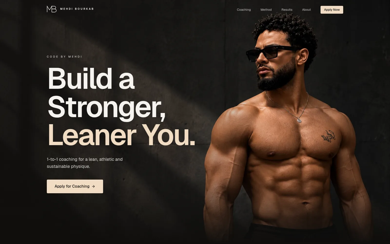
A monogram, an art direction and a website for a 1-to-1 physique coach — dark, quiet and confident, with every section leading to one place: the application.
The brief
Mehdi Bourkab coaches men online, one to one, on training, nutrition and accountability. The fitness space is loud — neon, stock gyms and shouting headlines. He needed to look like the premium choice, and make applying feel like the obvious next step.
Our response
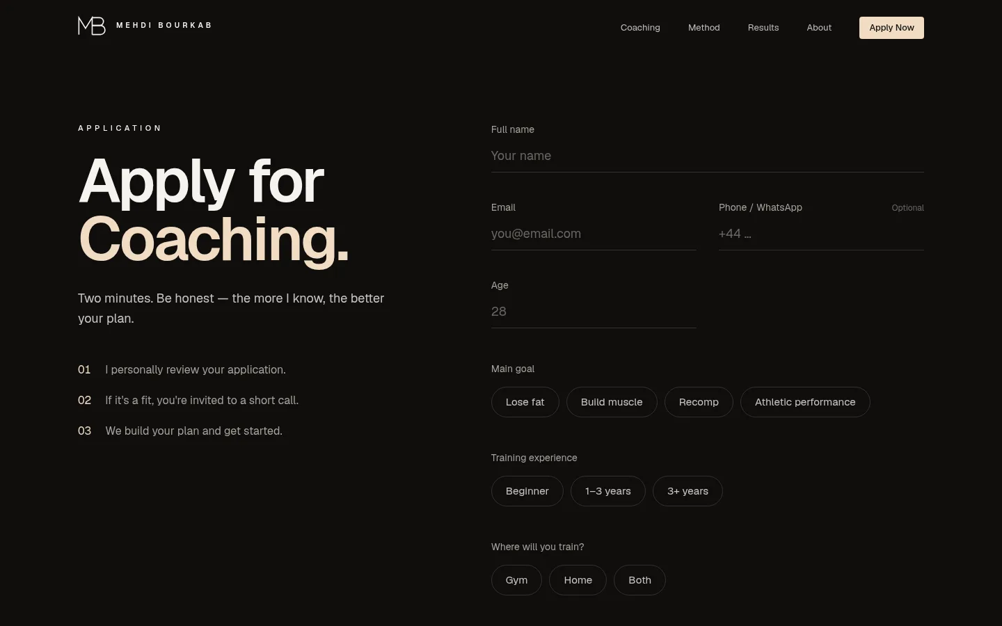
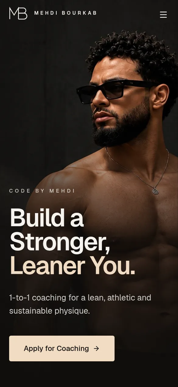
We drew an MB monogram where the M's right leg doubles as the B's spine, then built a near-black world with bone-white type and a single sand accent. Big, tight headlines and portrait photography carry the page; the copy is short and plain. Every section ends with the same call to action, which leads to a two-minute application with tap-to-choose answers.
Scope
Design breakdown
How it was made.
6 decisions that shape the whole site — from the mark to the last button.
- 01Mark
One line, two letters.
The monogram is drawn as a single stroke. The M's right leg is the B's spine, so the mark reads as one idea, not two initials.
- 02Colour
Near-black and one accent.
A warm near-black, bone-white type and a single sand tone kept for what matters: the call to action and the second line of each headline.
- 03Type
Tight, heavy, honest.
One typeface throughout. Headlines are set huge and tightly spaced; body copy is small and calm, so the eye always knows where to go.
- 04Image
The coach is the brand.
Portrait photography in soft, low light carries the page. No stock gyms and no clutter around it.
- 05Layout
Split screens that hold.
On desktop the section title stays in place while the detail scrolls beside it, so long lists still feel short.
- 06Path
Every road leads to apply.
Each section ends on the same button. The application asks only what the first call needs and explains what happens next.
What we shipped
Every detail, considered.
- 01
MB monogram
One continuous line: the M's right leg becomes the spine of the B.
- 02
Photo-led hero
A full-screen portrait with a slow zoom and the headline set over shadow.
- 03
A simple method
Train, Fuel, Progress — the whole offer in three words and three icons.
- 04
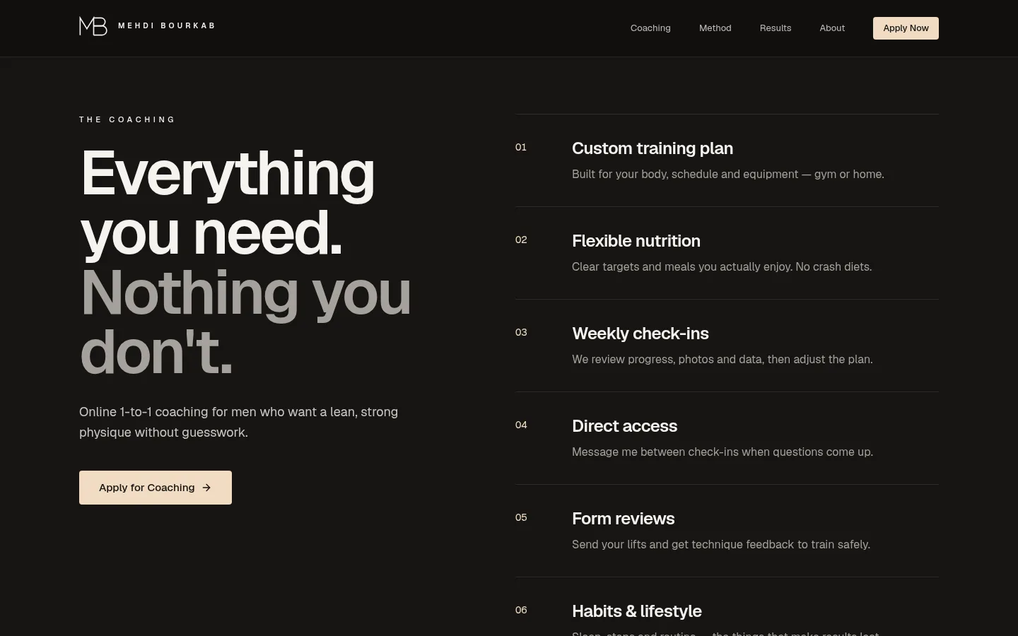
What's included
Six coaching inclusions and a three-step process, numbered and easy to scan.
- 05
Two-minute application
Goal, experience and training location as taps, not typing.
- 06
Built for phones
The headline, photo and call to action all land on the first screen.
Palette